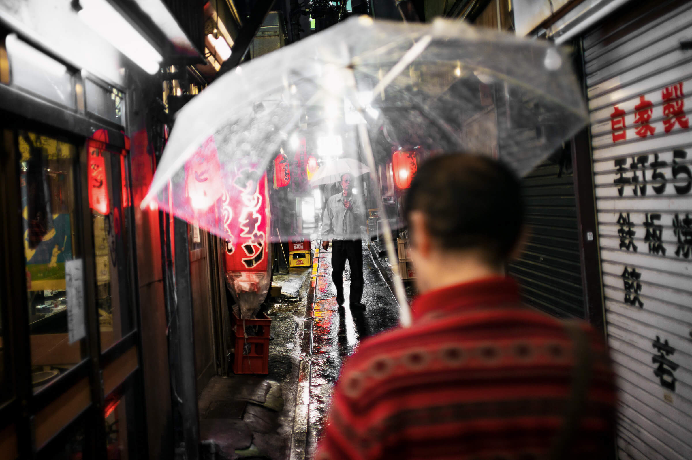
With rainy season now well and truly upon us, I was reminded of a photo from many years ago, taken in an alleyway I still frequent. Back then, I opted for contrasty black and white, and the resultant image can be seen here.
Returning to the original, however, it seemed a shame to miss out on the reds of the lanterns, and of course the reflections — an aspect of the colour version I really like. At the same time, it does miss some of the atmosphere that’s so unique to monochrome. But either way, it’s a photograph I still have a soft spot for, so without any further text, here is version two.
Coli says
Color is definitely nice! Love how the colors blend together with the wetness from the rain.
Lee says
It’s a very different photo, isn’t it?
Thanks! Not a fan at all of being out with the camera in the rain, but those colours you mention definitely make it worth it worth the hassle.
Denton says
There’s so much I like about this. Framing. Colors. Reflections. Atmosphere. All awesome! 🙂
Lee says
Thank you! Definitely a photo I remain very happy with.
Linda says
This is great. I have to confess I almost always like color better than black and white, but in this case I think I am right, because it really is one of your magical shots where all the colors coordinate.
Lee says
Cheers!
I go through phases, both in regards what I want to take, and what I enjoy seeing. But yeah, the colours really do work well with this one. Not that I saw it all at the time of course, but even if planned, I’d have struggled to coordinate them quite so well.
cdilla says
Whilst both have great appeal, and the reds on the shinies really make the colour photograph, it is the black and white version that gets my vote.
The reason is the weird way the umbrella seems more transparent and focuses attention on the central figure. In the Colour version there is a bright blurry cloud over the centre of the frame.
Lee says
Cheers. Yes, that’s a very good point. I was surprised how much clearer the man was in the black and white shot. To get the same clarity with the colour version came at the expense of the plastic looking very unreal.